New layouts, maps, and a redesigned job experience
EasyLink now has three browsing modes, a new map screen, a redesigned job page, and faster in-app flows.
This is the biggest EasyLink update so far.
A cleaner way to browse jobs
We redesigned the app with a fresher interface, introduced three job browsing modes called Compact, Detailed, and Swipe, and rebuilt the job details screen to make each opportunity easier to understand at a glance.
Better job details
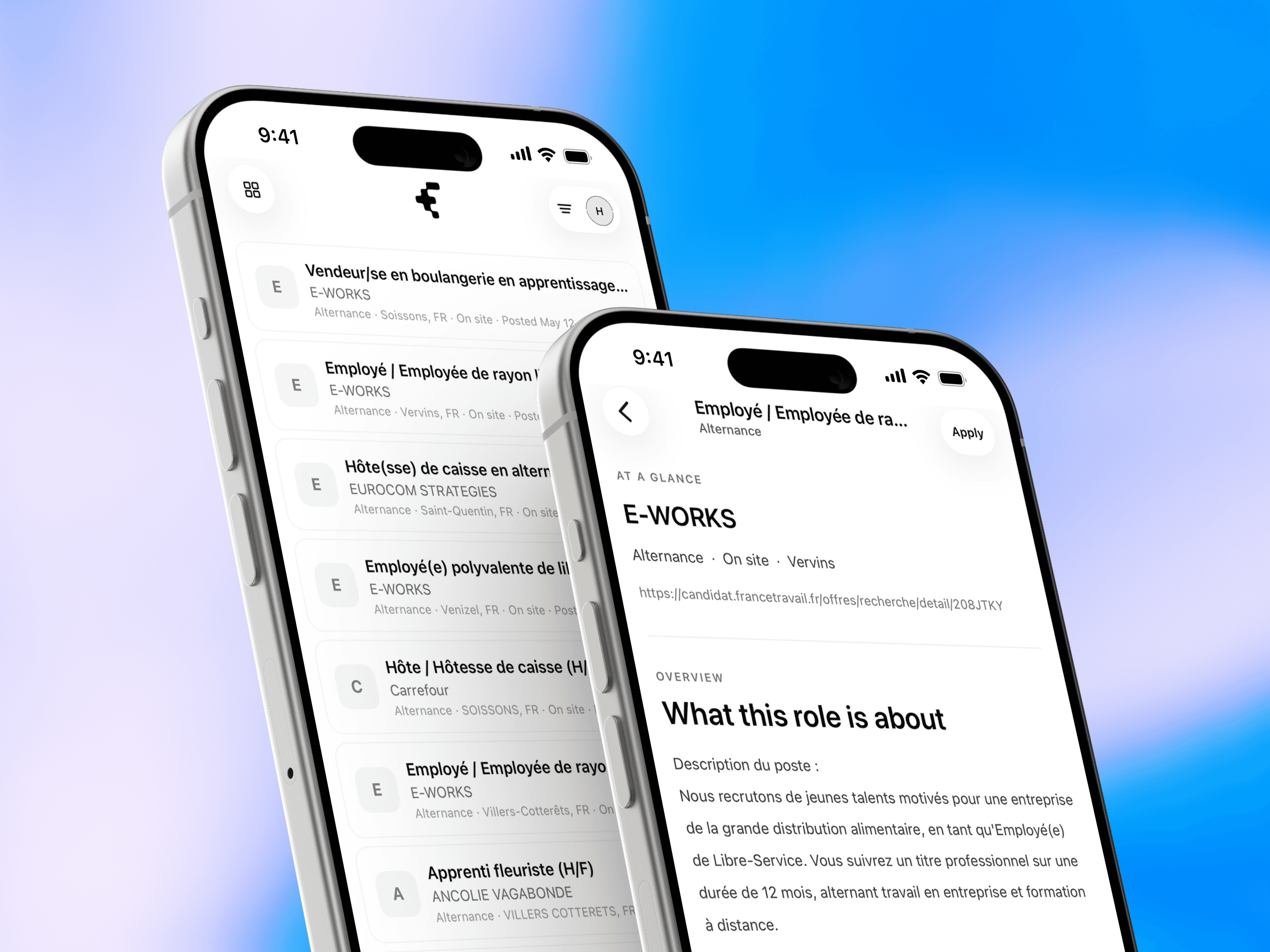
Job details now include three tabs: Overview, Information, and Map. The new Information tab surfaces the most relevant details in a cleaner format, while the Map tab shows where the selected job is located.
A new map screen

We also added a new map screen to the main navigation. After granting location access, users can see nearby jobs within a 25-kilometer radius, tap pins on the map, and jump directly into job details from there.
The result is a product that feels easier to scan, easier to compare, and more useful when you are trying to understand which opportunities are actually worth opening.